A conceptual branding project.From the The International Center of Photography website; The ICP is a center where photographers and artists, students and scholars can create and interpret the world of the image.
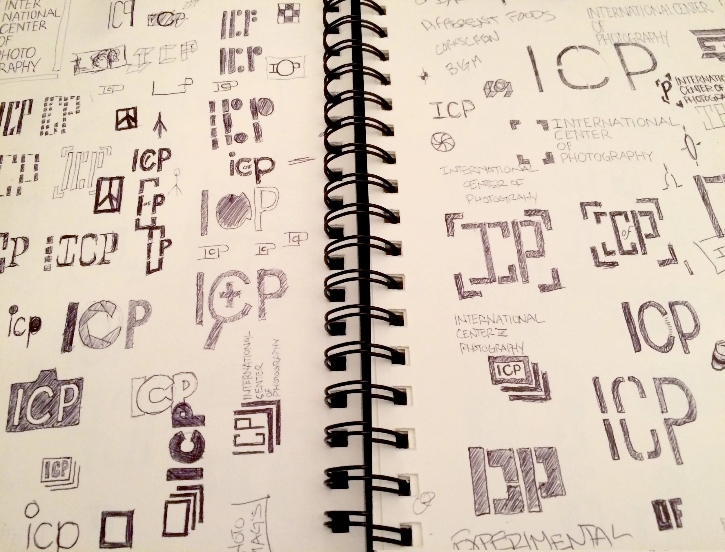
My initial logo exploration revolved around the initials. Deconstructing them, sometimes introducing familiar photo icons into the mark. Afterwards surveyed how the ICP is currently using their logo[s]. I discovered that they did in fact have alternate versions which utilized the initials. These seemed to be used in instances where as the format dictated the full proper name proceeded a logo and appeared on trade and consumer sites where visitors were more likely familiar with the ICP and their mark—what I believe to be the initials themselves cleverly designed into a metering icon. But could be reading into it too much.

As an accompanying mark chose the 'burst' icon which is sometimes also used as gallery. I decided on the fully spelled-out version. I'd considered including the initials in the final version which isn't entirely inappropriate in the logo universe however didn't feel it was here. The brief we were provided described, part of their aspirations were continuing to grow their education department which I felt strongly meant making certain who or what the 'ICP' was, was perfectly clear. But understood that there might be instances where an initial-mark might be needed so continued simultaneously working on the alternate initial mark. Working with such a long name meant minimizing the footprint of the logo with a condensed font. I chose Teko which had a little more character than what the ICP is currently using and very fortunately came in a variety of weights.

Out of the gallery/burst icon pulled the bracket out with which I'd envisioned using as a frame of sorts for images and information.


